Back in September, I posted about how my math exit slip process had evolved over time, becoming more effective through the use of technology. My system has taken another term, which has made it easier for everyone involved.
The process I was using in September used the Formative.com website. That website has many features I was not using. Since I wasn’t gaining benefits from those other features, Formative was a big, clunky tool for my purpose. Creating and viewing the exit slips was a slow process for me. Using the web app or the iPad app was a slow process for my students. The drawing tool was rough, and the text tool non-existent on the iPad which made their work difficult to read and encouraged sloppiness. It was better than anything else I had tried, but it wasn’t the formative assessment nirvana I was seeking.
A few months ago, I read about a new Google Forms feature. It is now possible for form participants to upload a file. For me, that was the missing piece. (You can read Google’s announcement here. )
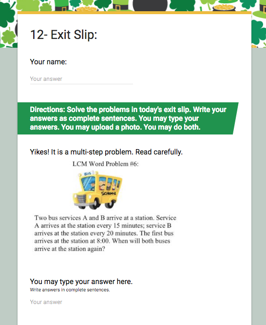
Armed with this new tool, I set about revising my process yet again. For each math unit, I create a Google form to use as a template. It has all of the needed parts EXCEPT the item that lets them upload files. For each exit slip, I make a copy of that template and rename it accordingly. Here is this unit’s template. (Forgive me the St. Pat’s theme. They are kids. They seem to appreciate the theme change each unit.)

Notice that I included a name line. I could have the form automatically capture their username, but that requires logging in. My students have been good about putting their name on their submissions, so this has saved them time.
The question with the bus is just a photo. Each day’s exit slip is already in the lesson’s Google Presentation. I snap a screen shot of it and upload it in place of the image in the template.
My students have three options each day of how to complete the exit slip. Their first choice is to type their answer. Their second choice is to upload an image. Sometimes that is a screen capture, and other times is it a photo of a physical model, or something they have worked on whiteboard or notebook. Their final choice is to both type and upload. I’m surprised at how often they choose the latter. To give them this choice, neither item is a required option in the form
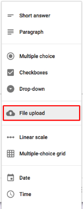
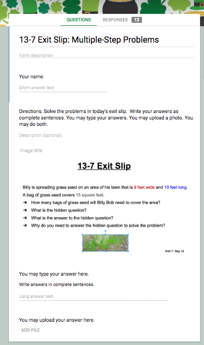
Next, I add the file upload item. I can’t have that item already in the template. When I tried that, the forms always had a problem and deleting the item didn’t fix it. Instead, I add that item to each exit slip. It is one of the item types when you select to add an item.

When you select that option, you can choose how many files a participant can upload. I let students upload 5. Since my students are supposed to show me their exit slip before they submit it, student often end up revising and adding their revised image. Brain research suggests that feedback is most useful within 20 minutes of completing a project. This lets me provide that 1-on-1-just-in-time reteaching that seems to make the exit slip educational for them and an assessment tool for me.

With the last item in place, I grab the URL of the live form, and add it to the unit’s math assignment page.
Most of my students complete the exit slip in class. For students who don’t, I can view their slips either in the form itself, or by sending the form responses to a spreadsheet.
From the first day, my students liked the Google Form exit slips. The tool no longer gets in the way of them showing what they know. All around, it’s a win.
