One of my quests this year was to develop an online showcase for student projects. Five years ago, most digital student projects were word processed documents that could be printed out, or Powerpoint presentations that could be presented or printed.
Now in addition to those formats, we have podcasts, videos, Bitstrips, Voicethreads, Glogs, and other formats. We are also starting to see more open-ended projects where teachers let students chose how to share their learning.
About a third of our teachers and specialists have their own blogs or wikis. Two of our classes are using student blogs as digital portfolios. A number of others are using Powerpoint as a digital portfolio platform and embedding or linking to their projects. Some digital projects can be saved as .wmv or .jpg or .mpe and dropped in our online photo galleries. The rest have been more problematic to share. For the rest of the classes we need a digital showcase.
In addition to showcasing student learning, I saw other uses for this showcase…
- Share examples of projects with teachers during planning meetings
- Share exemplars with students at the start of a project
- Share exemplars with WASC accreditation teams
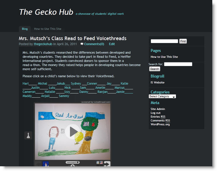
We clearly had a need, but we weren’t sure which format to choose. Our school has a Wikispaces account and an Edublogs campus account. We could make a case for either platform. In the end we decided on Edublogs. At this time, the blog templates were better looking, and the platform was easier to work with. You can view it here.
Our original theme was much better looking but the font size was too small and we weren’t ready to start modifying the CSS template. We switched to our current theme which is not nearly as attractive but the black background makes the student work pop visually. It met our needs in terms of allowing the needed search widgets.
We set up a number of categories to allow us to search effectively. We have categories for grade level, subject and tool type. Now I am realizing we should add the ISTE categories as well. Since it is the computer teacher and myself adding projects, that should be manageable.
The search field should allow visitors to search by teacher’s name, making it easier for families to use.
We are just starting to add student work to the blog. I am liking that the newest projects appear at the top of the main page, that we don’t need to create the navigation links, and that each post really has its own “page” so teachers can add the link to their newsletters.
I am not loving the unfinished look of this theme, but I’ll leave it for now.
I am learning how to modify embed codes to make for a more attractive post. For example, embedding a full-sized glog doesn’t work very well. The right side of the glog gets cut off. Fortunately, I can modify the embed code, making the glog appear at less than full -size. Now I need to find that magic combination of easy to read but still fits in the blog.
Creating the posts is time-consuming. I am hoping my assistant will be able to help. Another problem may be storage. At the end of the year we tend to clear out most student projects from our subscription services. We need a way to mark the exemplars so they don’t become dead links on the blog.
I suspect at the end of each year we need to go in an modify the posts, removing the link to each child’s project and leaving only the exemplars.
While we’ve clearly only made baby steps, it is a start. I am confident we will continue to refine it into a powerful tool. I’d love to hear how you are showcasing student work online.

